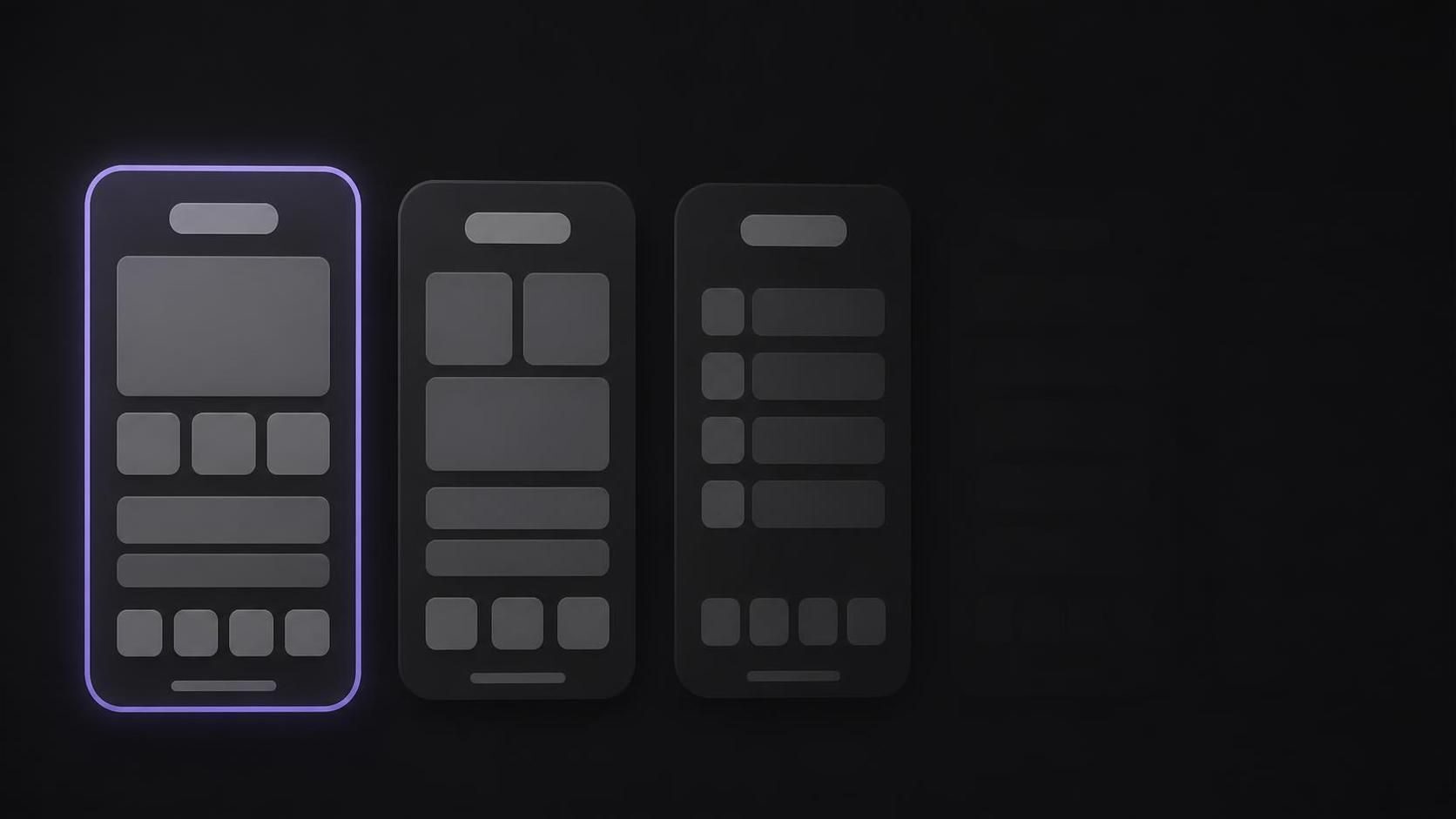
TLDR
What should go on my first three App Store screenshots, since only they show in search? Give each one a job. Frame one: the main outcome, on the real screen that proves it. Frame two: the core action. Frame three: what sets you apart. Show real UI under a short caption, check the three at thumbnail size, and test frame one on its own.
Your first three App Store screenshots are what most people see before they decide to tap. Below: a job for each, the store rules that apply, and how to tell whether frame one is costing you downloads.
What should go on my first three App Store screenshots, since only they show in search?
Apple's product page guidance is the source for the "first three" idea: "Depending on the orientation of your screenshots, the first one to three images will appear in search results when no app preview is available, so make sure these highlight the essence of your app." Your listing can hold up to ten screenshots. Frames four to ten are mostly seen by people who already tapped.
So the first three talk to someone scrolling a list of similar apps. A useful split:
- The outcome. What the user gets. Your strongest benefit, in a caption, on the screen that shows it.
- The core action. The thing people do most in your app, shown mid-task.
- The difference. Why this app and not the one above it in the results.
The App Store screenshot design guide covers the whole set; this one stays on the first three.
Frame one: the outcome, on the screen that proves it
The caption. Name the result, not the feature. "See where your money went" tells a stranger what they get; "Smart dashboard" makes them guess. A few words, set large, at the top. How to write App Store screenshot captions goes through caption patterns in detail.
The screen. The one screen where the outcome shows at a glance: the filled budget, the finished edit. Use believable, fictional data; Apple's guideline 2.3.9 asks for "fictional account information instead of data from a real person".
What does not belong there. A logo, a welcome screen, a sign-in form. Apple's App Review Guidelines, section 2.3.3, say screenshots "should show the app in use, and not merely the title art, login page, or splash screen." Prices are out too: 2.3.7 says screenshots "should not include prices." On Google Play, the preview asset guidelines also rule out "Best," "#1," "Top," "New," "Discount," "Sale," "Million Downloads" and calls to action such as "Download now."
Main screen or value statement: do both in one frame
Apple's guideline 2.3.3 help page spells out the rule: App Review "will approve only those submissions where more than half of screenshots show the app in use." With three screenshots, two must show the app. Google Play's guidelines ask you to "prioritize UI in the first three screenshots as much as possible."
Logo or splash | Raw main screen | Value statement only | Caption over the real screen | |
|---|---|---|---|---|
Apple 2.3.3 | Rejected if the set is mostly this | Allowed | Counts against the majority rule | Allowed (overlays are fine) |
Google Play, first three | Against the guidelines | Fits | Against "prioritize UI" | Fits; tagline at most 20% of the image |
Reads in a search thumbnail | Yes, but says nothing | Rarely; UI text is tiny | Yes | Yes, if the caption is large |
Tells the searcher why | No | They have to work it out | Yes, without proof | Yes, with proof |
The caption sells and the screen proves it. Apple's own wording for overlays is the limit to keep in mind: "Don't let overlays or marketing visuals crowd out your app."
Frames two and three: the core action and the difference
Frame two, the core action. If frame one is the result, frame two is the work that gets there: adding an expense, trimming a clip, checking off a task. Show it in progress, captioned in the user's words.
Frame three, the difference. Search your main keyword and look at the apps around you. Whatever you have that they lack belongs here: an offline mode, a widget, an iPad layout, a one-time price. If you cannot name one, use your second-strongest outcome.
Every frame stands alone. A caption like "Step 2" depends on a frame the reader may have skipped.
Order them so the app reads in two seconds
1
Put the three frames side by side, scaled to fit across a phone screen, roughly as search shows them.
2
Show them for two seconds to someone who does not know the app, then take the phone away.
3
Ask what the app does. If the answer matches frame one's caption, keep the order.
4
Ask which frame they remember. If it is frame two or three, that frame may belong first.
5
Check the captions read at that size, with no "text in small font sizes or backgrounds that compete with the text" (Google Play's words). Cut words before you shrink the font.
Most first frames get better by cutting: fewer words, a calmer background, one screen instead of two.
Is the first screenshot the problem? Read App Analytics first
In Apple's App Analytics definitions, an impression is counted when your app is "viewed on the Today, Games, Apps, and Search tabs of the App Store for more than one second", and it includes product page views. Conversion rate is "total downloads and pre-orders divided by unique device impressions." The numbers only appear once you have at least five first-time downloads or pre-orders.
What the numbers tell you. Compare impressions with product page views. If people see the app but few open the page, they decide in the search result, and the first screenshots are a prime suspect along with the icon and name. If many open the page but few download, frame one is doing its job, and the problem sits further down: later frames, ratings, the description, the price.
Test frame one alone. Apple's Product Page Optimization lets you test "up to three alternate product page versions against your original," for up to 90 days, and it recommends waiting for "at least 90% confidence" before you apply a winner. New screenshots go through App Review, but a test without alternate icons does not need a new app version. Change only the first frame, so a result tells you something. How to A/B test App Store screenshots walks through the setup.
Results can be large in either direction. In a SplitMetrics case study, OLBG removed the headline from its first screen and added small feature callouts, and that variant converted 45% better. A small app may not have the traffic to reach 90% confidence, so make the first test a big, clear change rather than a tweak.
Google Play needs its own test. Hobnob ran a set of screenshots that lifted conversion on Android, rolled the same set out to iOS, and saw conversion drop: "these screenshots actually reduced our conversion rate by 20%," they told SplitMetrics, and they restored the old ones. Google's store listing experiments advise "testing a single asset at a time" and running "for at least a week."
Build the three frames once, for every store
Once the three frames work, the rest is production. App Store screenshot sizes 2026 has the current pixel sizes, and how many App Store screenshots covers what to add after frame three.
ListingShots, our app, is a desktop canvas for this job on Mac and Windows. Frames sit in rows, sized by store presets (iPhone, iPad, Google Play, Microsoft Store) or a custom size such as 1320 × 2868. You drop in your real screenshots, add captions and a background, and export the frames you select as PNGs. It is a one-time purchase of $15.99, with no subscription, and it works offline. It does not make video or animated app previews; for a preview in the first slot, a video tool is the better choice.
Frequently asked questions
FAQ
Frequently asked questions
Both, in one frame. Put the value statement in a short caption at the top and the real main screen below it. Apple approves a set only when more than half of each device's screenshots show the app in use, and Google Play asks you to prioritize UI in the first three, so a value statement on its own wastes a slot.
Check App Analytics in App Store Connect. If impressions are high but few turn into product page views, people decide in the search result, where your first screenshots sit. Then run a Product Page Optimization test that changes only the first frame and wait for at least 90% confidence before applying the result.
Apple says the first one to three screenshots appear in search results when no app preview is available, so a preview takes that space when you have one. Previews run up to 30 seconds and autoplay muted on the product page, which makes their first few seconds do the job frame one would otherwise do.
The jobs carry over, but test each store separately. Hobnob's same-background set raised conversion on Android and cut it by 20% on iOS. Google Play also caps taglines at 20% of the image and lists words to avoid, such as "Best", "#1" and "Download now".
✦
Three frames, every store size
One-time $15.99. No subscription. A desktop app for Mac and Windows that lays out your first three screenshots, and the rest of the set, on one canvas and exports each frame at the size the store asks for.
macOS 12+ · Windows 10+ · One-time purchase